UX and Web3 Design Guide — The Top Challenges of UX/UI Design in Blockchain and How to Tackle Them
Web3 is evolving with a tremendous speed. And a lot of fintech startups are ready to embrace it. But there is still plenty of challenges, that we as UX/UI designers must face and tackle. In this guide, we will unfold the 4 most challenging things in Web3 design for fintech startups.
The mass adoption of blockchain technology is promising to shape the new future of the Internet which is called Web3. As the adoption of decentralised technologies grows, it opens up a myriad of new possibilities for Fintech platforms and digital products.
A decentralised economy is the core idea of Web3. And while the user experience may resemble the same patterns as in conventional Fintech products; the UX design in Web3 and blockchain is anything but simple, due to its tech’s innate characteristics and complex jargon.
So, understanding the challenges of UX/UI design in Web3 is becoming paramount for business owners and product designers who strive to remain competitive in the new digital age of Web3.
A short brief into Web3 - The new era of the Internet

Although Web3 and blockchain are often used interchangeably, these two are quite different. Web3, a term first coined by the co-founder of the Ethereum network back in 2014, is an umbrella term referring to decentralised applications that run on peer-to-peer protocols.
But the final concept of Web3 is still a bit hazy because the technology and its mass adoption are only at their middle stage.
What’s key is that Web3 products are always built on a public blockchain, and hence promote the features of a decentralised economy. For fintech products, as you may already know it means that conventional finances can be decentralised eliminating the need for any middle-man.
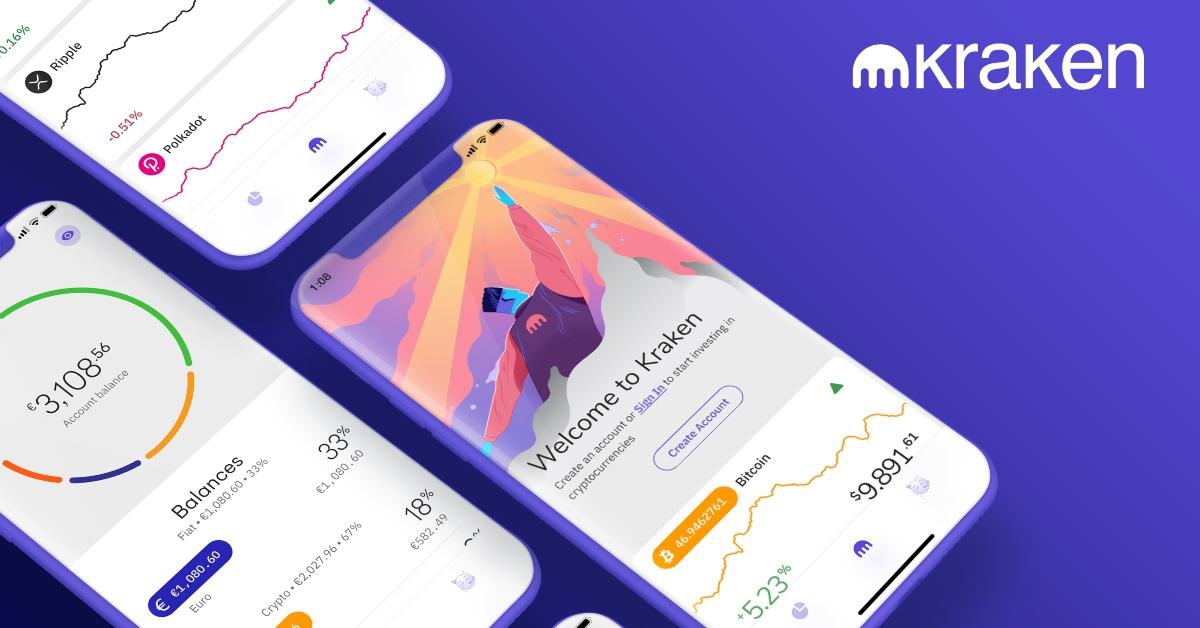
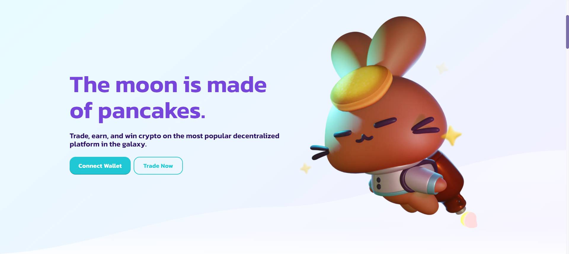
DeFi (decentralised finance) protocols like Compound, DEX (decentralised crypto exchange) like Pancake swap, OTC exchanges, and and even CEX (centralised crypto exchanges) like Kraken are all fintech products in Web3.
But there is more!
Blockchain technology is the crucial fundamental building block of Web3. To illustrate it fully — imagine the ability of creators and users to take back their ownership over their content or possessed digital assets.
“Web3 brings a parallel decentralised world, where tokenisation of processes, actions, and data, is going to enable people with ownership of data and actions. Web1 and Web2 have laid a foundation for the audience to want Web3.” — Shilpa Karkeraa, CEO & founder of Myraa Technologies.
While in Web 2 (the current Internet version) users don’t own their data, corporations do. The main goal of Web3 is to improve user interactions by building dapps (decentralised applications) that carry crucial decentralised principles:
- Trustless. Users can run dApps freely and maintain them on a network in a way that gives them full control. This is drastically different from Web 2, where gigantic corporations have full power over how sites and apps function and what information is shared. Interaction within blockchain networks and Web3 dApps doesn’t require fluttering trust in a centralised provider. It’s possible because of the verifiable user actions, items, and parts of the ecosystem within a network.
- Permissionless. It’s providing a democratic approach for joining and interacting with a network for users; the only thing that is needed is their MetaMask or any other crypto wallet to communicate permissionless with Web3 dApps.
- Decentralised. Self-governing blockchain network in the core. There is zero control from the “big tech” or monopoly data centres to maintain and provide it. Users are acting like nodes and having up-to-date copies of the networking and governing it with their day-to-day interactions and contributions.
- Open-source. The code of DeFi protocols and dApps should be open-source similar to public ledgers. Furthermore, native payments and direct p2p transactions shouldn’t require a payment service to exclusively facilitate payments.
As you can see, these principles are fundamental for Web3 dapps to run and function. At the same time, they create a steep learning curve for an average user with zero technical background.
And meanwhile, the expansion of Web3 is ramping up and various apps and products are trying to attract more new users. The Web3 design is becoming full of legit challenges, that we (product designers and owners) will have to tackle.
First challenge — Explaining the obvious in Web3 design

For many general users out there it still might be frightening to interact with dApps. Even though the principles of Web3 are beautiful and functional, it needs a meticulous approach to make the interactions easy and comprehensive for users.
Users without a proper background can often get confused in the overcomplexity of the blockchain terminology like — swap, gas, consensus mechanism, private key, etc. So, explaining to users what might seem obvious to us (product designers) and developers is one of the key challenges in Web3 design. On the contrary, in conventional fintech products, there is less need in explaining to users elementary things like how to enter a deposit to trade.
Everything changes, when we have to deal with a DeFi product. For example, designers must outline a predictable journey for a user to enter a deposit. When trading on DEX or a DeFi protocol, depending on the network, the gas fees (a commission per translation) may fluctuate constantly. So, informing the user about all gas fee fluctuations and the reason for the changes is a must.
Building a highly informative design is the key in this case, but it can easily end up as a slippery slope with informational overload for a new user.
Therefore it becomes challenging to design a truly user-friendly and at the same time powerful DeFi Fintech product with a range of unique features accessible to the average user. In this case, a good solution will be to alleviate the experience through communication; if a user isn’t experienced enough to immerse into the full set-up, it’s better to offer him a lightweight version of the product.
Not only intuitive UX design but also a highly comprehensive one
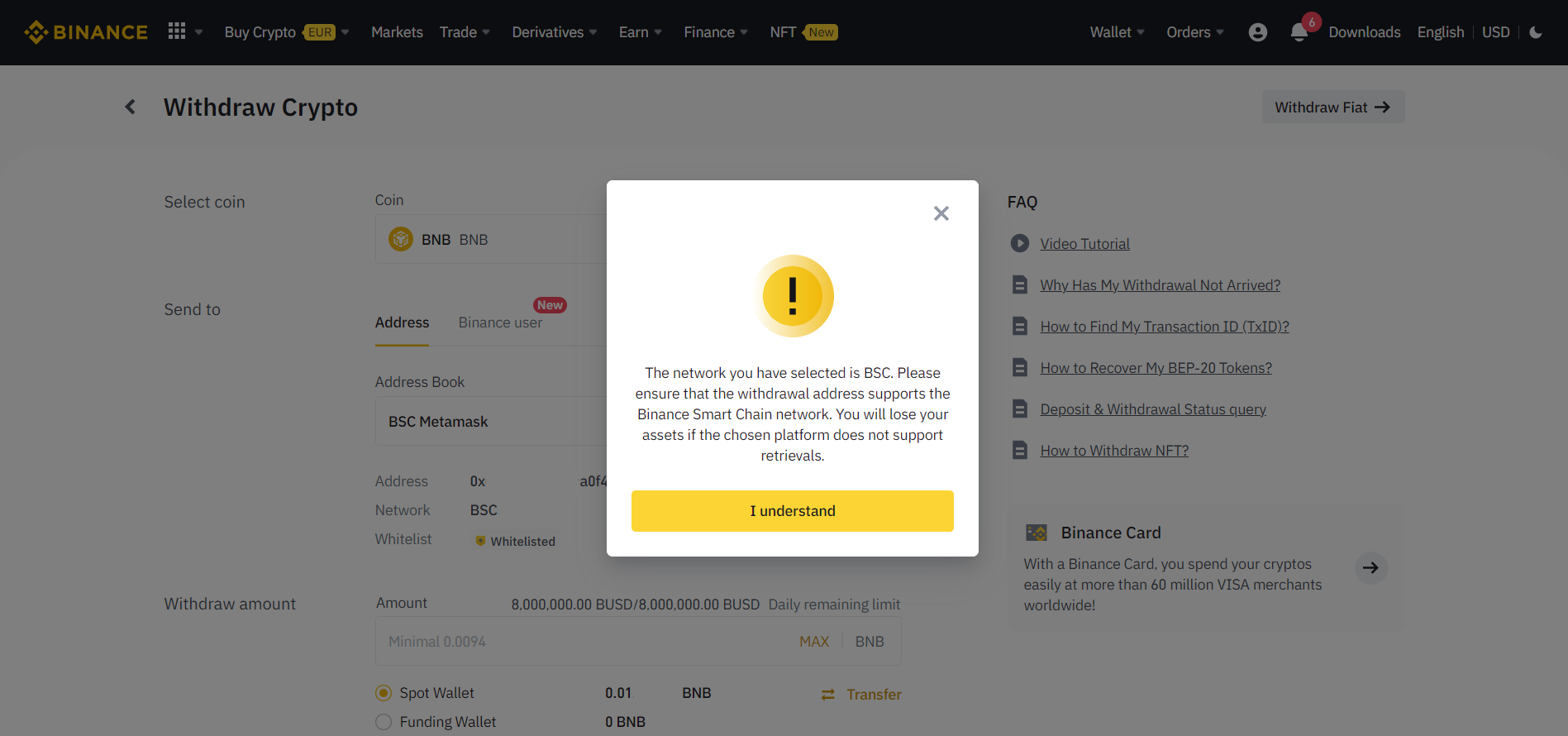
A highly comprehensive Web3 design will mean an effortless user experience for newcomers. It is important to tackle the complexity of Web3 jargon for mundane features, that users will be using daily, such as swapping (trading or exchanging one token for another), transferring assets on-chain, etc. Using simple and clear messaging and communications is thus essential, especially during any transaction stages where users might face the risk of permanently losing their money.
For example, why a user should conduct transfers only through the “right” network (for example — Ethereum) for his ETH when moving assets to a different wallet? Otherwise, it will cause a permanent loss of funds.
- One of the ways to tackle this is to deliver the most user-friendly prompts in the shape of pop-ups or warning on-screen notiqcations
- Another way is to invest in user-friendly guidelines and documentation. When a Web3 product is too powerful, these are very much a must.
To make the guidelines and documentation easy to understand, provide a summary of each section, linking them to all relevant technical parts. Offer users access to interactive glossaries that will enable the easy check of the Web3 definitions, slang and jargon. To make guidelines even more comprehensive and engaging designers can mix in infographics and animations that illustrate Web3 concepts.

Second challenge — More efforts to instil product trust
In Web3 lack of clear explanation mixed with an inability of any transactional rollbacks or disputes through customer support can be a recipe for diminished trust in a fintech product.
Due to the nature of blockchain protocols, any transactions that users make are immutable, meaning they are permanently sitting in a public ledger.
When it comes to the Web3 design for fintech products, it takes an additional toll for designers to convey this into the UX/UI.
Web3 design requires a display of additional security warnings for users that help prevent them from losing their assets by an accident, or even worse by a poor interface. It’s always good to think three steps ahead of users in Web3 design to increase product trust. When a user’s expectations match the transactional outcome it’s a win.
For example, when transferring assets to another wallet, it is important to check the wallet address without confusing it with its private key. The trick is that the private key must not be exposed anywhere, otherwise, the wallet can be considered compromised.
Furthermore, there should be a seamless display of all the events on a network that may affect the user experience. Transaction delays, estimated processing times, or even the simplest things like wallet balance reflection should be openly communicated and connected with the events on a network in real-time.

How to show the immutability of a blockchain in UX design
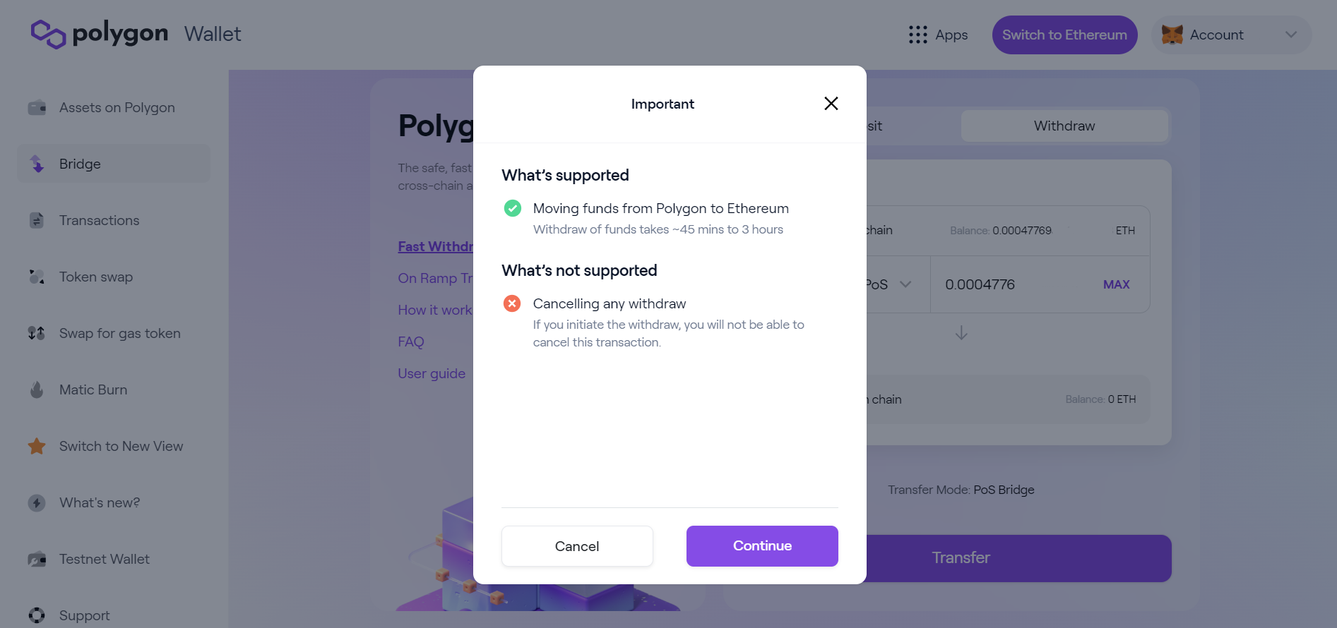
Transparency helps to increase trust in Web3 product. It is important to openly illustrate how blockchain immutability works by giving proper security warns, even in simple cases of UX.
Many actions (besides financial transitions) that users perform in Web3 apps are transactional-based, and that action might be irreversible.
It’s important to build a clear algorithm for users on what is immutability in blockchain by learning and navigating them frictionlessly through a product.
This can be enhanced with tactile features on mobile devices or responsive and urgent security warnings on desktops that require user confirmation.
Third challenge — Impress with creativity, but don’t distract from features
It is a standard for most Web3 products to impress users with a creative design and fascinating animations or website flow. The aspect of the decentralisation of the industry gives products the flexibility and freedom to unveil their creativity and build a whole brand identity based around a sushi emoji, for example.

For Web3 products it’s crucial to stand out. Because it should be exciting and memorable for users, while creating a strong connection with a specific crypto target audience. On the other hand, many different products in Web3 are trying to compete with their extraordinary brand identity. By doing so, many Web3 product owners can lose the sharp image of their audience, and hence lose the valuable connection with the potential users.
The importance of profound UX/UI research in Web3 design
To avoid misinterpretation in design it is essential to invest more in building an excellent brand identity. The UX/UI research could take reasonably long, but it will make a truly impactful change to build loyalty and connection with customers.
For fintech products in Web3, the urgency of this factor goes even further.
Fourth challenge — Hardly accessible blockchain explorers for users
The last challenge in Web3 design is blockchain explorers. They can directly affect the user’s experience when sending and receiving funds.
What does a blockchain explorer mean for Web3 design?
Blockchain explorers are very important tools for every decentralised network in Web3. They are responsible for all the information and details about the user’s transactions on-chain. These tools are also allowing users to retrieve any public data regarding transactions on a blockchain network in real-time.
Because blockchains are public ledgers, any user online is capable of retrieving such data from blockchain explorers as — info about made or pending transactions on-chain, wallet addresses, blocks, gas fees (transaction fees), etc. Users can also get data about smart contracts and nodes. Each blockchain always has its own blockchain explorer.
However, for Web3 products, that means that user transaction data is highly dependent on blockchain explorers.
The biggest challenge here is that it could be very difficult even for advanced crypto enthusiasts to read blockchain explorers.
Transaction history visualisation with explorer API
However, there are few solutions how to tackle the challenge of reading blockchain explorers. First, the best thing to do is to avoid linking transaction status on a blockchain explorer itself. Instead, it is better to link a transaction on an explorer additionally. Using an API of a blockchain explorer widget with data visualisation can be a way to go.
Unfortunately, there are not that many ready-to-use solutions for even the notorious blockchain as Ethereum. So, the chances that buliding one and designing one on Web3 product’s behalf are quite high.
Final thoughts
As the number of Web3 fintech products is rising — our mission is to stay dedicated to the customer-centric design and to enhance the adoption of new technologies. Web3 challenges designers with its tech-rooted language, a steep learning curve for average users, and a low frictionless user experience.
But these challenges are encouraging us to shape a better Web3 UX for the end customers, creators and users.
We already know how to tackle these challenges, and are all set to create a consistent, comprehensive Web3 design.
Our top goal is to make the onboarding seamless for new users of any Web3 fintech product and to build the highest trust level by simply making Web3 design better.
Need help with your fintech product design?
We have worked with dozens of fintech businesses, from investment brokers to crypto neobanks to BNPL providers, and we know how to fix your product design once and for all.


